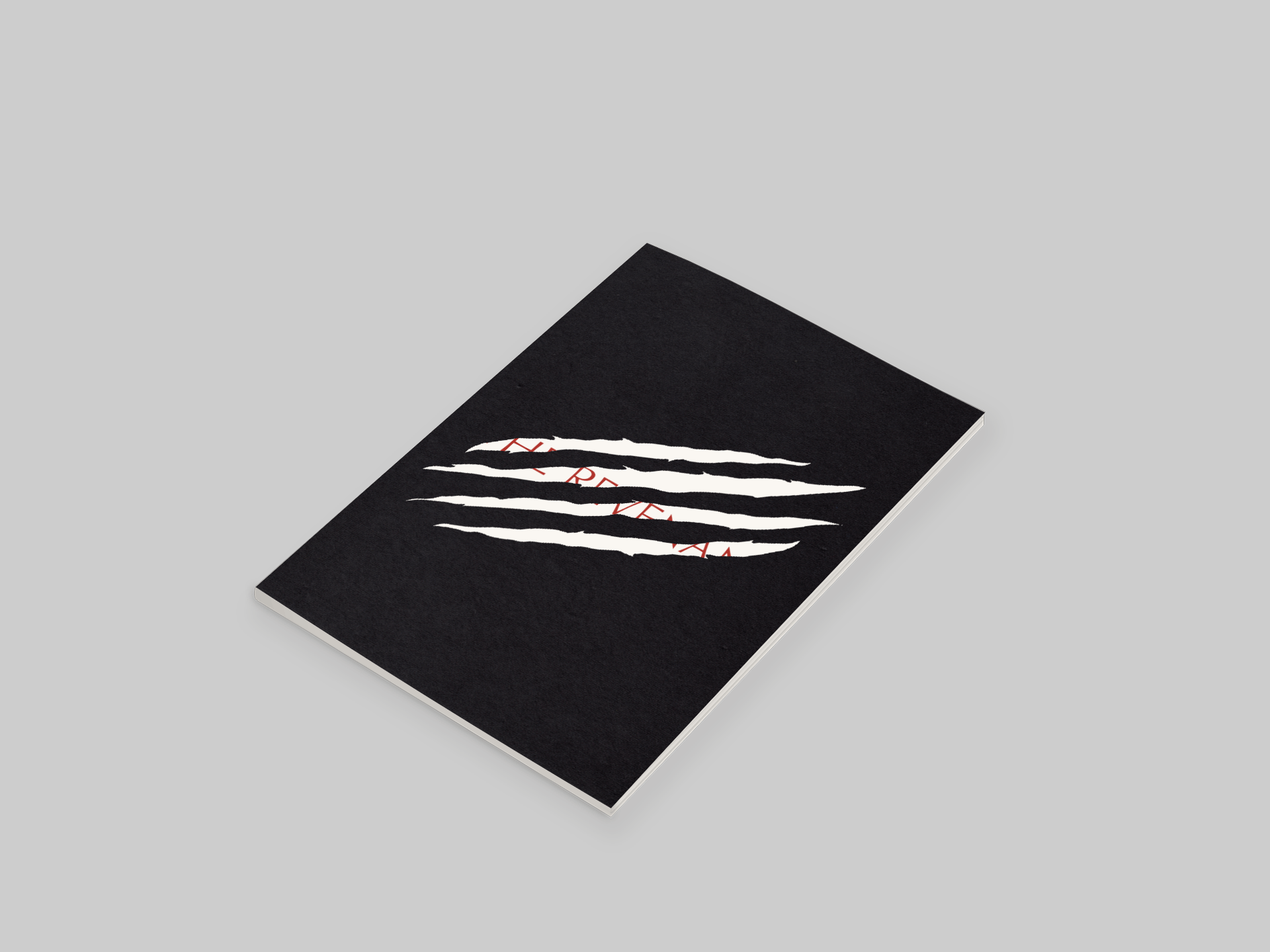
This book is based off the acclaimed film The Revenant. The film contains
plenty of bloody violence, including some very shocking imagery, so it only
made sense that this book should include the same.
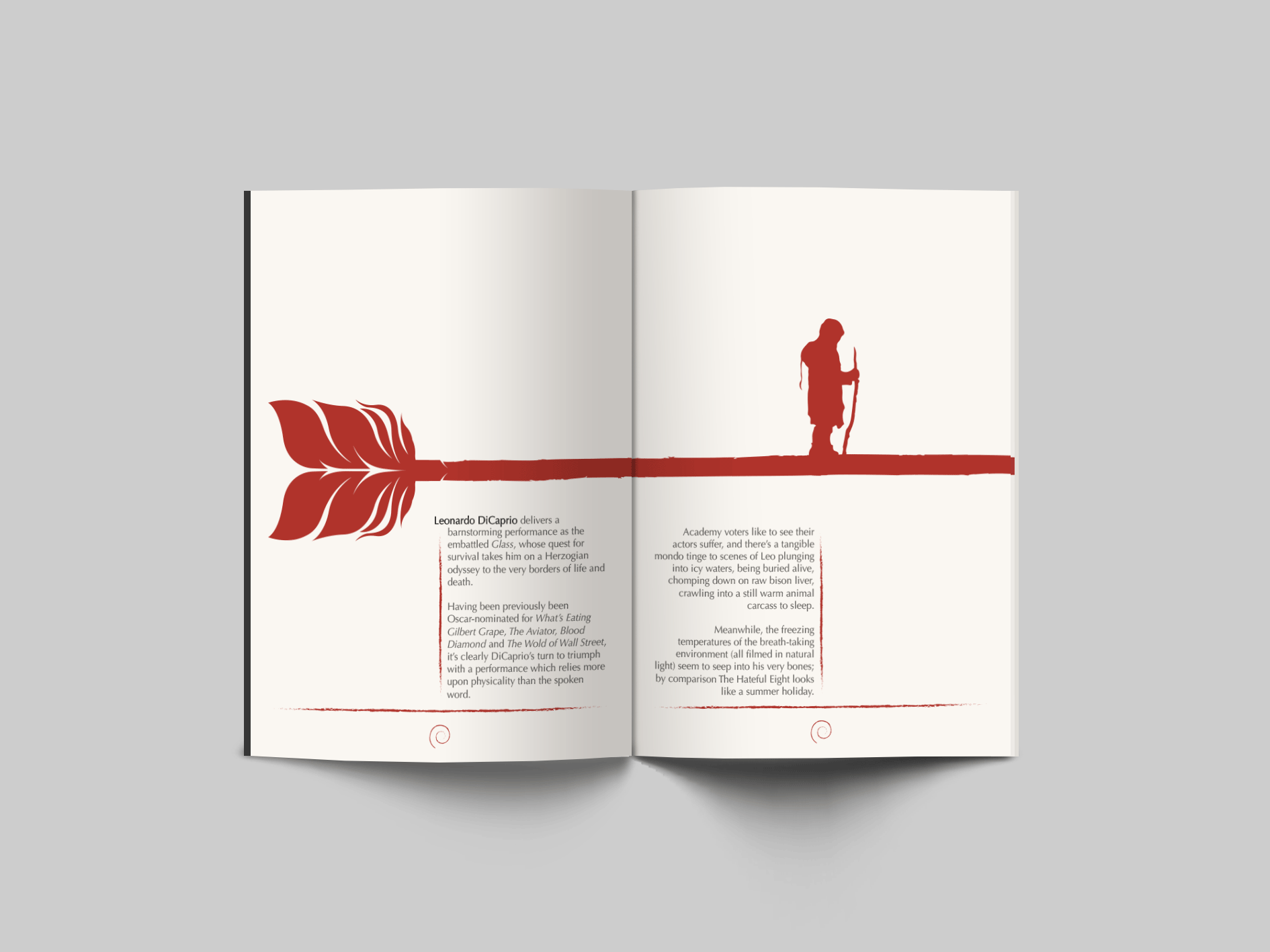
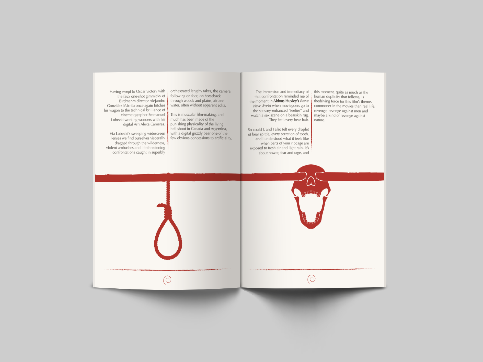
Imagery like an arrow, ancient technology utilised by the Native
American Indian, which was traditionally used to hunt bison and elk,
but non-traditionally used in the film to hunt down and kill the British-led
trapper expedition. The arrow spans the pages from beginning to end,
allowing for other elements which compile together into a coherant unit.
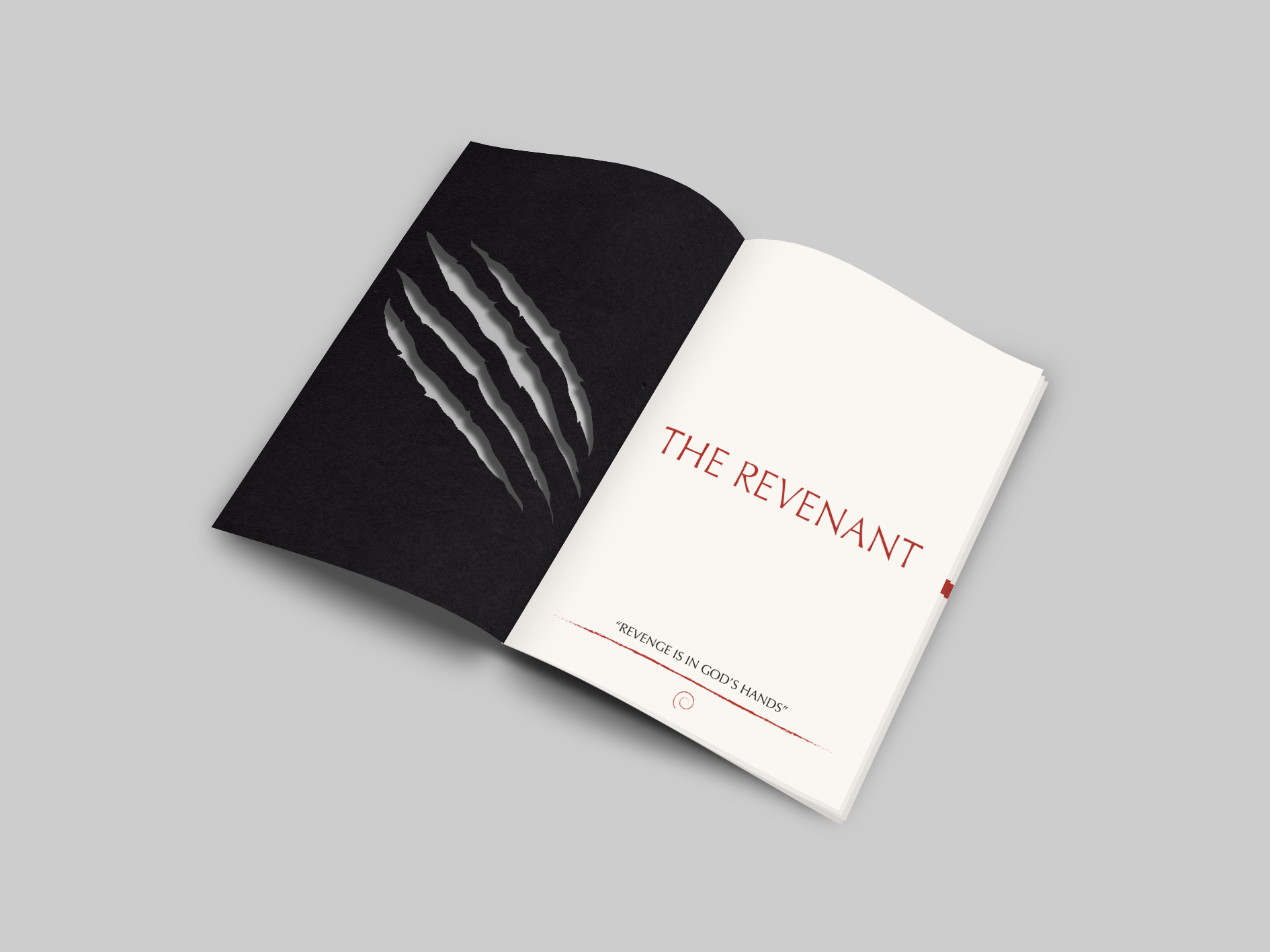
I used the colour red because it is the colour of blood, but it’s not blood, it’s
red. Ideally, for the sake of contemporary relevance, I would have printed this
book’s contents in blood. However, not only would this have been messy
unless the appropriate steps were taken, but there were also other variables
impeding the process. In designing this book, red still served as a powerful
accent colour, and was not treated carelessly.
It has a strong and bold presence. It also has a slight tint to it, which made it
more identifiable with dried blood staining the pages, making its imagery
seem more primal, eliciting extreme emotions like anger and especially
violence, but perhaps more than anything else, the colour red and how it
was implemented, manipulates similar emotional states to that of the film.
However, in my professional opinion, it would have been more effective at
creating those associations if my crimson or scarlet tones were, how should
we say, more realistic.
Graphic Book
The font used for the film's title wasn't terribly imaginative in my opinion. Though the typeface itself is
beautiful, it was a beautifully boring design decision. Though boring can be beautiful, there is a limit to
how far you can take it.
I tried to make a parallel use of Futura, making slight but noticable changes to its identity and message.
I wanted to give each of my letterforms a keen edge, which led to them having a sharp bend leading to a
point; not rounded or blunt, like a knife, or atleast a representation of something death-dealing, which
helped give me a defined visual block.